
Upgrade Your Drupal Skills
We trained 1,000+ Drupal Developers over the last decade.
See Advanced Courses NAH, I know EnoughHow to Build a Card Component
One of the most popular components on any website I've worked on is the card component. Depending on the website, the card component is used to group various pieces of content into a container which can be used throughout your website. Here’s an example of a card component in one of our projects.
In some instances, a card can be a user profile, content teaser/excerpt, latest news or events. Today we will build a card component which will contain the information for the latest events. This card can be used in the /events page to list all the latest events taking place. The card can also be used in other pages and it may need to be displayed slightly different than the original card, this transformation is called "variations" and is usually achieved by passing a modifier CSS class to the original component which we can use to write different styles for the card. More on this later.
Let's get started
First, let's take a look at what we are building so we have a visual of the code we will be writing.
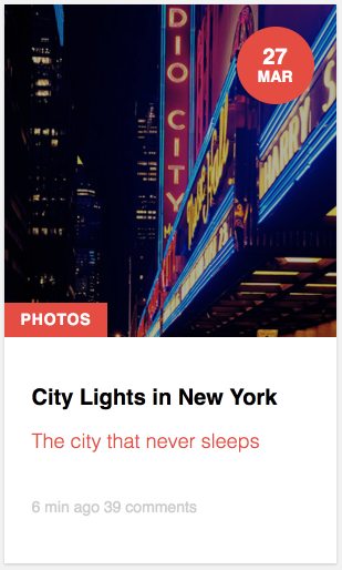
As you can see from the images above, our card takes different shapes but the information in it remains the same or similar. This is a common practice to modify components based on where and how they are being displayed.
Let's build the card
Identify component's fields
Before starting to write any code, let's take a close look at the card images to identify the fields or data elements the card needs. From the images above we can see the following fields will be needed:
- Image
- Title
- Subtitle
- Excerpt
- Label or category
- Label for comments
- Label for time posted
Typically, components are built following the Atomic Design approach which basically means breaking things down into small pieces (atoms) and then combining those pieces to build more elaborate components.
In the interest of time, we are going to skip building each piece as its separate component and instead we will build the card as a whole. I recently wrote a blog post on building flexible headings which demonstrate the approach I usually take when building components.
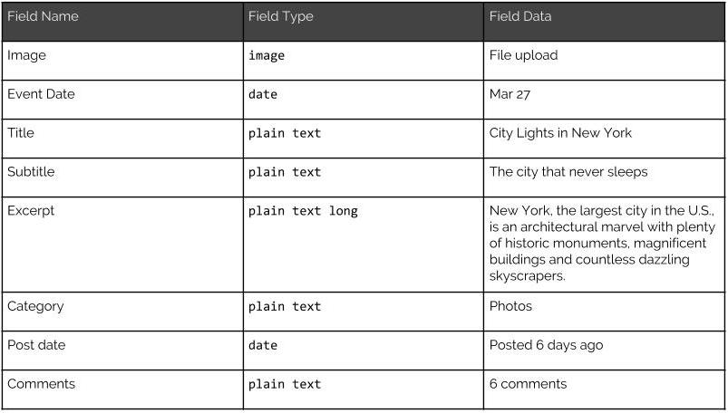
Architecting the component fields
We know the fields we need but it is helpful to determine what type of fields they are and what they will be called. The table below gives us a good visual of our fields architecture.
Writing the code
1. In your components or patterns directory in your project, create a new folder called `card`
2. Inside the Card folder create two new files
- card.html
- card.css (we're using CSS to keep things simple. Feel free to use Sass if you'd like).
3. In your card.html we'll start with the basic structure of the card
<article class="card">...</article>
So we've created an article tag as the card's container. Why <article> and not <div>? Well, since the card is intended to contain an event's info, if we place a bunch of cards together it makes sense that each card is an individual event article.
4. Next we are going to create wrappers for the two types of data the card will hold. The two types of data as we have seen from the table above are: Image/media and text or content. Let's modify our code so it looks like this:
<article class="card">
 <div class="card__media">...</div>
 <div class="card__content">...</div>
</article>
The reason for splitting the image and the rest of the content is that this allows us to move things around independently of each other to create different variations of the card. More on this later.
Let's pause to review how content will be laid out
If we look at the card images above, we see that some of the fields are either on the image side and others are grouped together separate from the image. Although we could potentially place fields in the image or content wrappers, it makes sense to place them in the wrapper where they visually appear.
For example, the date and label fields (Photos), look like they belong in the same group as the image. The rest of the fields will go in the Content wrapper.
5. Let's start with the image wrapper:
<article class="card">
 <div class="card__media">
   <img src="http://placehold.it/300x300" alt="Card image" />
   <div class="card__date">
     <span class="date--day">27</span>
     <span class="date--month">Mar</span>
   </div>
   <span class="card__category">Photos</span>
 </div>
 <div class="card__content">...</div>
</article>
So let's focus in the fields inside card__media. We see we have our image, which in this case is rendering a placeholder image. Then we have a wrapper to hold the date fields (day and month). Again, wrapping these two together makes it easy to manipulate them as a single item rather than two separate fields. Lastly, we have the category for this content (Photos). Since all these fields seem to belong together, it makes sense to place them the way we have. Later on, we will use CSS to place each of the fields in their right position.
6. Now let's place the remaining fields inside the .card__content wrapper. We will temporarily hide the fields in the .card__media wrapper to focus on the other fields. Modify your markup to look like this:
<article class="card">
 <div class="card__media">...</div>
<div class="card__content">
<header class="card__header">
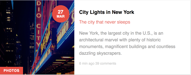
<h2 class="card__title">City Lights in New York</h2>
<div class="card__subtitle">The city that never sleeps</div>
</header>
<p class="card__excerpt">New York, the largest city in the U.S., is an architectural marvel with plenty of historic monuments, magnificent buildings and countless dazzling skyscrapers.</p>
   <footer class="card__meta" role="contentinfo">
     <span class="card__post-date">6 min ago</span>
     <span class="card__comments">39 comments</span>
   </footer>
 </div>
</article>
So the first thing we did was add a `<header>` tag to wrap the title and subtitle fields. The header tag is a great way to indicate the role content plays in our component. In addition, using semantically correct markup makes this component SEO friendly as well as accessible. Next we have the teaser content wrapped in a <p> tag and finally, we add another semantic tag which is `footer` to wrap the publish date and comments fields.
Why this markup?
I'd like to bring up a couple of things to your attention regarding how I arrived at the markup above. First, we are using BEM for naming CSS classes (card__title, card__comments, etc.). BEM is great for creating associations on your component fields. By looking at the markup you know where each field belongs. This makes it easier to identify where you would find the styles or other assets for the component within your project when you have tons and tons of components. The class card and all the other field classes are unique not only to this component but in the entire project. This gives us the peace of mind that our styles will not inadvertently affect other areas of the website.
Notice I created two containers within the card (`card__media` and `card__content`). This allows me to split the card content into groups I can manipulate individually and independently of each other. This will come in handy when we need to create a long or wide card. In addition, by grouping multiple fields into a single container it is easier to manipulate the fields with CSS as a group rather than individually.
Atomic Design
If you are familiar with Atomic Design, you know the recommended way for building components is to break things down into the smallest pieces possible. For example, in the card structure above, each of the fields that make up the card can actually be its own individual component. Then we would combine them all into a whole new component (card). In the interest of time/work, I am not breaking the card component into atoms. However, if I were building the card for a project I would definitely do that as this allows for components to be reused and save time/work in the long road.
Putting the entire card together
Now that we have built each piece of the card, your **card.thml** file should look like this:
<article class="card">
 <div class="card__media">
   <img src="http://placehold.it/300x300" alt="Card image" />
   <div class="card__date">
     <span class="date--day">27</span>
     <span class="date--month">Mar</span>
   </div>
   <span class="card__category">Photos</span>
 </div>
 <div class="card__content">
   <header class="card__header">
     <h2 class="card__title">City Lights in New York</h2>
     <div class="card__subtitle">The city that never sleeps</div>
   </header>
   <p class="card__excerpt">New York, the largest city in the U.S., is an architectural marvel with plenty of historic monuments, magnificent buildings and countless dazzling skyscrapers.</p>
   <footer class="card__meta" role="contentinfo">
     <span class="card__post-date">6 min ago</span>
     <span class="card__comments">39 comments</span>
   </footer>
 </div>
</article>
Card Styles
Now that we have the markup ready for the card component, we can begin writing our Sass/CSS to style it. I am not going to go into detail about the styles as I have commented the parts that may need some explanation and should be easy to understand. The main take away from writing styles for components with unique names is that there is little to no CSS nesting. This makes overriding styles an easy task if there is ever a need to do so. In addition, styles written for a component like this, don't run into the risk of leaking into other areas of the website.
That's a lot of CSS but it's all necessary to achieve the look and feel of the card. It is important to know that your markup file (card.html), needs to reference your styles file (card.css) for things to work. This may be obvious but if you are following along that's an extra step that needs to be done.
Creating a card variation
If you would like to see the card displayed wide or horizontally, modify your card wrapper to look like this:
<article class="card card--wide">...</article>
Notice that by passing the CSS class of `card--wide` to the original card component we are able to change the orientation of the card from long to wide giving us an alternative variation to use without having to rebuild the card from scratch. These variations are pretty powerful and present many advantages.
If you look at the styles, you will notice there is a block of CSS in which the card--wide is changed to move the card's content to the right of the image. This is a great way to provide alternative views of a component without having to recreate the markup or styles for a component.
In closing
Building components is one of my favorite things to do as a developer and there are many advantages to this style of theming. It's important to think through how components will be used so you can plan ahead how to best build a component that can be reused. Rushing through building components without having a full understanding of where and how a component may be used can lead to duplicating code or redoing your work to accommodate new project requirements.
About Drupal Sun
Drupal Sun is an Evolving Web project. It allows you to:
- Do full-text search on all the articles in Drupal Planet (thanks to Apache Solr)
- Facet based on tags, author, or feed
- Flip through articles quickly (with j/k or arrow keys) to find what you're interested in
- View the entire article text inline, or in the context of the site where it was created
See the blog post at Evolving Web