
Upgrade Your Drupal Skills
We trained 1,000+ Drupal Developers over the last decade.
See Advanced Courses NAH, I know EnoughCompetitive Analysis: The Key to a Woman’s Healthy Heart - Part 2
Heart disease is the No. 1 cause of death for women in the United States. We are honing in on DrupalCon-host city Baltimore, which has launched several initiatives to combat cardiovascular disease. Johns Hopkins Medicine and the University of Maryland Medical Center are two large university hospitals local to Baltimore that have centers dedicated to women and heart disease. Using women’s heart health as our focus, we compared select search outcomes, menu hierarchy, labeling, and landing pages.
Step 1 was a cursory competitive analysis of two health system websites that we covered in part 1. Step 2 is competitive user testing to validate the conclusions that we made from the preliminary competitive analysis.
Competitive user testing is a useful way to see how your site measures up against your competitors’ sites. By taking a look at how patients may interact with your site and competitor sites, you can compare their experience and make changes that allow you to better serve patients’ specific needs. You can implement competitive usability testing even if you have not completed a preliminary competitive analysis.
Since we last discussed websites and women’s heart health, we held two user tests to compare site visitors’ experiences when navigating the Hopkins Medicine and University of Maryland Medical Center (UMMC) health system websites.
We chose tasks based on actions that people might perform on a health system website. We also considered the type of information women look for when seeking information on heart disease.
For our user tests, we asked two women who are Maryland residents between the ages of 40 and 70 to complete several tasks on both the Hopkins Medicine and University of Maryland Medical Center websites without using search.
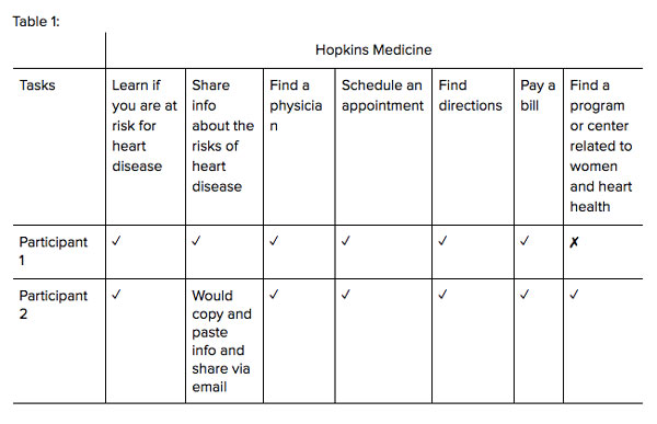
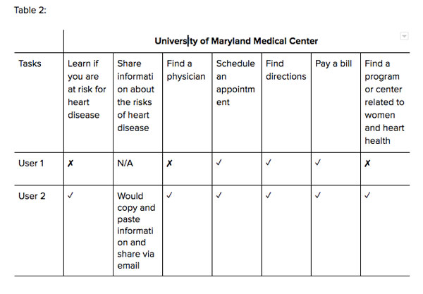
Tasks we asked participants to perform:
- Learn if you are at risk for heart disease
- Share information about the risks of heart disease
- Find a physician
- Schedule an appointment
- Find directions
- Pay a bill
- Find a program or center related to women and heart health
Select Findings
We found:
- “Health” and “Healthy Heart” labels provide users with a quick pathway to heart health risk information
- Users successfully completed the majority of top tasks (i.e. schedule an appointment)
- Finding programs and information about risks associated with women’s heart health is challenging
- Multi-level navigations and redundant label terminology created complex pathways for users
The experiences of these two women revealed some challenges that might be experienced by other site visitors. Our findings warrant additional usability testing to further evaluate, compare how these and other health system websites help patients seeking information about programs and centers that address women’s heart health.
“I would never [pay my bill] this way, I would pay it online [through my bank].”
Highlights and Challenges
“Health” and “Healthy Heart” labels provide users with a quick pathway to heart health risk information.
On the Hopkins Medicine’s health system website, both the first and second participants successfully found “know your risks” on the Healthy Heart landing page (see Figure 2) when looking for information about heart disease risk. The second participant said Hopkins Medicine performed better than its UMMC counterpart in describing the factors that put people at risk for heart disease.
When navigating the UMMC website, the second participant navigated to the Women’s Heart Health Program landing page and said the description of risks were symptoms associated with heart disease and not actual risks. “They don’t say, blood pressure, overweight, sleep apnea,” she commented. The first user did not locate risks for heart disease on the UMMC website.
Figure 1: Hopkins Medicine Healthy Heart navigation menu
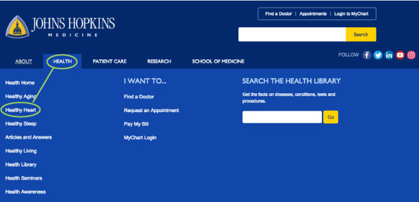 Hopkins Medicine’s main and secondary navigation labels (Health > Healthy Heart) gave users quick access to information on heart disease risk.
Figure 2: Hopkins Medicine Healthy Heart landing page
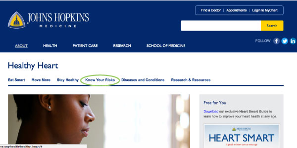 “Know Your Risks” featured prominently within Healthy Heart local navigation makes heart disease risks easily accessible to users.
Figure 3: UMMC Women’s Heart Health Program landing page
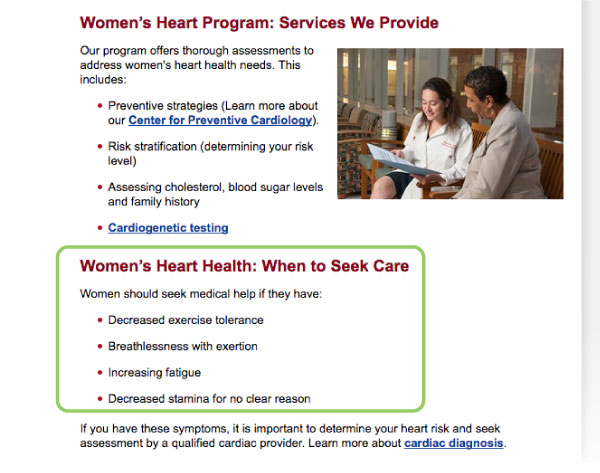 UMMC’s women’s heart program landing page does not present information about heart disease risks that is easily accessible.
Participants successfully completed the majority of top tasks (i.e. schedule an appointment).
Both users successfully completed the majority of top tasks such as find a physician, schedule an appointment, find directions, and pay a bill. The first participant did not find a way to get physician on the UMMC homepage and Heart & Vascular Center landing page. This may have been because of the placement of the calls to action in the sidebar (Figure 5), adjacent competing content (Figure 5) and the utility navigation and the “Find a Doctor” call to action button similarity in color (Figure 4).
“If I wanted to find a physician I woul[d] ...call a heart specialist first.”
Figure 4: UMMC main navigation and “Find a Doctor” call to action button
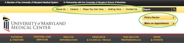 Calls to action for top tasks such as “Make an appointment” and “Find a doctor” blend in with utility navigation colors, which could make it hard for users to see these key buttons
Figure 5: UMMC Heart and Vascular Center landing page
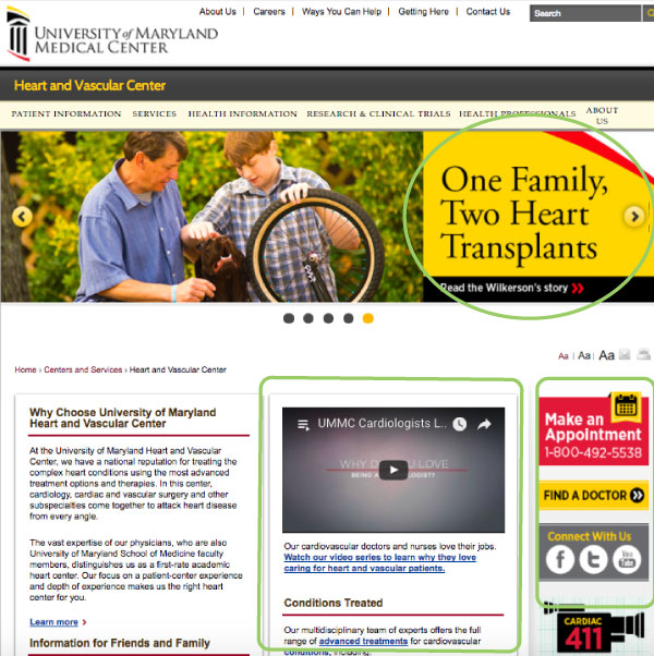 Calls to action for top tasks such as “Make an appointment” and “Find a Doctor” compete with UMMC Cardiologists video and hero news story “One Family, Two Heart Transplants” content.
Finding programs and information about risks associated with women’s heart health is challenging.
The first participant did not find either the Hopkins Medicine or UMMC’s programs nor centers related to women and heart health, even when visiting pages that were dedicated to cardiology or cardiovascular health. The first participant visited UMMC’s programs listing page, which contained separate links to women’s health and heart and vascular health pages, but did not list the Women’s Heart Health Program under either of these headers (see Figures 6 and 7).
After the first participant clicked on the Heart and Vascular Center landing page, she scanned Services, but did not find the Women’s Heart Health Program because the secondary navigation extends below the top half of the page masking the Women’s Heart Health Program. The first participant also was unsuccessful in finding a program or center related to women and heart health information on the Hopkins Medicine health system website. “I can find heart stuff, I just can’t find anything on women,” she said.
The second participant was able to find the Women’s Heart Health Program on the UMMC site; however, she remarked that it was challenging to locate: “It’s not intuitive how you would find a program here. Now I see it, but not before I’ve gone through too many exercises.”
Figure 6: UMMC programs landing page
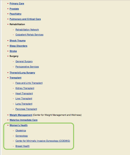 Women’s Health section on programs landing page has no mention of the women’s heart health program
Figure 7: UMMC programs landing page
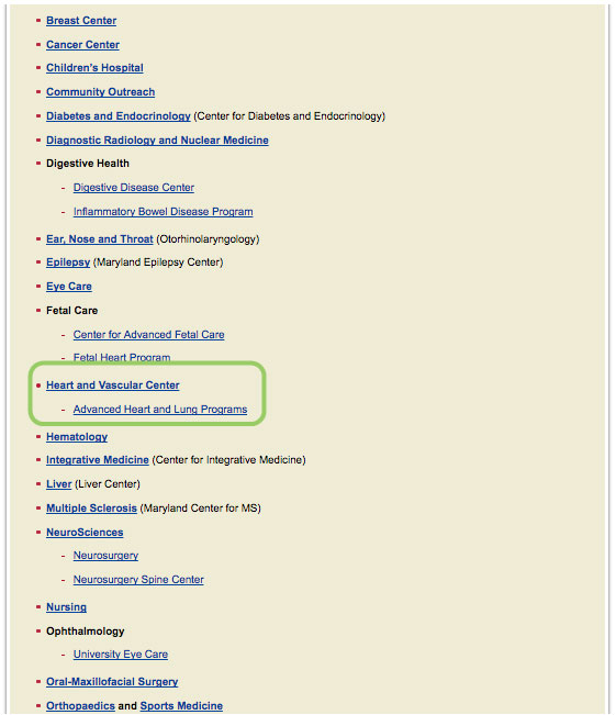 Heart and Vascular Center section on programs landing page has no mention of the women’s heart health program
Figure 8: UMMC Heart & Vascular Center landing page
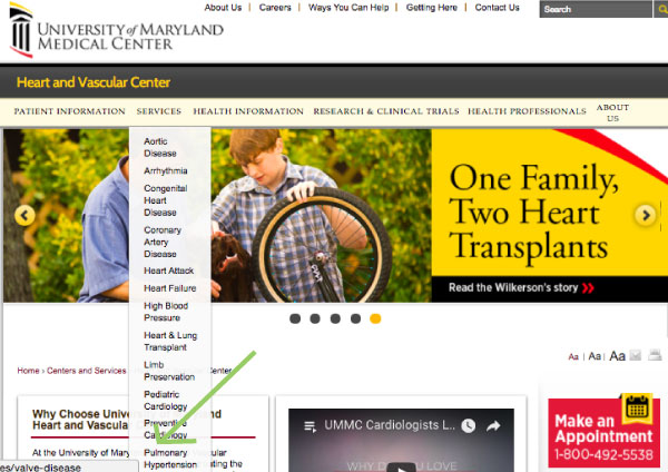 The local navigation for the Heart and Vascular Center landing page has items under “Services” that extend beyond the top of the page. One user stopped at Pulmonary Hypertension and missed the last item in the “Services” dropdown, “Women’s Heart Health.”
Multi-level navigations and redundant label terminology created complex pathways for users.
Participants had difficulty remembering how they got to specific pages because of redundant label terminology and deeply nested pages. When looking for information on risks for heart disease, the first participant had trouble using the main, secondary and local navigation to find this information, selecting Health information > Medical encyclopedia > Look up a symptom > Medical Encyclopedia > Your Health only to go back to the main navigation to click on Centers and Services and Patients and Visitors.
“I would always call because half the time it gets lost when you do it through the portal.”
Takeaways
We can gain a more nuanced understanding of how diverse patient demographics navigate and use health system websites by conducting competitive usability tests and focusing on a specialized medical issue such as women’s heart health.
While this study warrants additional research and usability testing given the small number of users, it does reveal challenges that are faced by many of our clients in the health care industry like navigation and findability.
To better serve patients and their caregivers, health system websites can take several steps to improve the experience for site visitors:
- Simplify their menu structure so that there are fewer levels and sub-navigations
- Remove competing content from areas of the page and improve color contrast, helping users access key buttons like “make an appointment” and “find a doctor”
- Reference and cross link to women’s heart health centers and programs on program pages
- Provide related content on pages that have resources on heart health and women’s health to improve findability
- Revisit alphabetizing navigation items in favor of featuring top specialities and health areas that are of primary importance to patient audiences.
In the health care field, meeting the needs of patients can be a matter of life and death. It is important for health systems to continually evaluate how their websites are meeting the needs of patient and caregivers and how they can improve the experience for patients and caregivers and best facilitate access to information about health services and resources.
About Drupal Sun
Drupal Sun is an Evolving Web project. It allows you to:
- Do full-text search on all the articles in Drupal Planet (thanks to Apache Solr)
- Facet based on tags, author, or feed
- Flip through articles quickly (with j/k or arrow keys) to find what you're interested in
- View the entire article text inline, or in the context of the site where it was created
See the blog post at Evolving Web