
Upgrade Your Drupal Skills
We trained 1,000+ Drupal Developers over the last decade.
See Advanced Courses NAH, I know EnoughApproach your Mobile-First Design with This Guide
It’s always a battle when planning a website design. Your end goals, target audience, content, user experience, everything must align. It’s like a cloud of thoughts right inside your team’s head. It’s critical to optimize your website experience for the devices your audience is or will be using.
Emarketer forecasts, approximately 83% of internet users will use a mobile phone to go online by 2021.

Since now that we’ve established the fact that mobile is where the future lies, a mobile-first redesign is a way to go. We’ll dive into what a mobile-first approach entails, including tips for creating a seamless experience for visitors from mobile devices.
In 2018, it is critical to analyze what’s the right way to go about it.
1. Shoot for the least
Without compromising the functionalities, it is definitely a challenge to pull everything into such a limited real estate. The difference in the screen space of various devices should tell you the varied approach to design.
Minimalism begins by removing every element one by one.
After listing down all the elements, prioritizing is key. Sort out the cruciality of every element and how would they hierarchically sit in the interface. This should be in a way that the most important elements are displayed prominently.
If after this exercise there’s still space for more, carefully add some elements in order of importance without overdoing it. Doing this would make sure every inch is utilised to the fullest.
Content Repository
The approach to this should be by drafting a document or a spreadsheet containing all the content elements you want the interface to entail.
List down the page titles, navigation titles and be open to comments from peers. An example is given below:
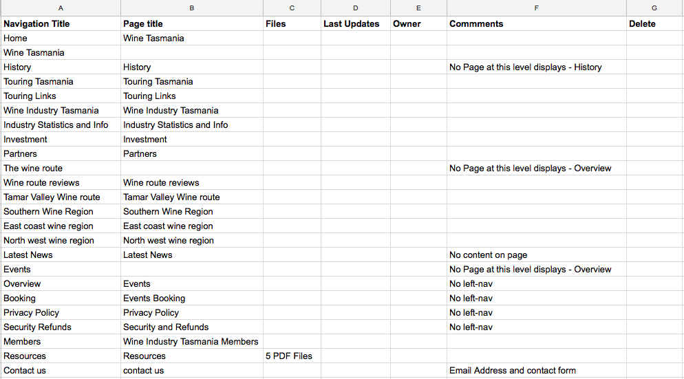 An example of a content repository
2. Analyse the Important Interaction Points
Comparing smartphones from 2008 to the ones in 2018, a lot has changed since then. The user experience is no more frustrating. Earlier you had to touch the exact alphabet in the keyboard now the smart devices can read your movement through sensors. Keyboards differ according to the smartphone size, button space and overall sensitivity. And so your mobile design should be approached in the same manner.
Unfortunately, many websites are still lagging behind when it comes to the user experience which leads to weak engagement, poor sessions and doubled bounce rates.
Make sure the important elements are not missed.
This includes:
- Make button more clickable
- Make CTAs more appealing and responsive
- Choose the right color combination for the user to read on the sunny noon
- Give hyperlinks plenty of space
- Keep the tabs in the drop down manner
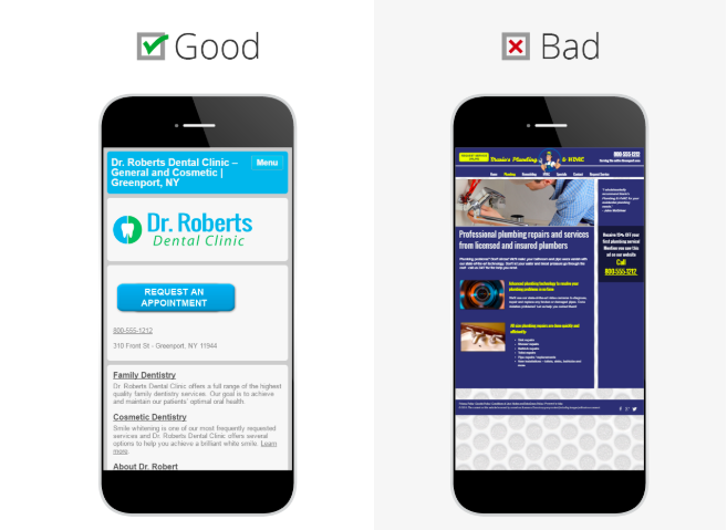 Good vs Bad UX design
The number of mobile phone users in the world is expected to pass the five billion mark by 2019, according to Statista.
3. Optimize Your Images
When it comes to loading size, images make up nearly 64% of an average web page. Outlining the “why”, it is now important to know how you can optimize your images to deliver an optimum and engaging experience to your user, without hogging on those extra kilobytes of data.
Hacks to Optimize Images
- Use correct image dimensions for faster loading
- Use the correct image format. JPEG image would be a lot lighter than the PNG.
- Compress your image with lossless compression
- Use Lazy loader to keep the user engaged
4. Content is all that matters
Devising content around mobile is time-consuming as it requires due thinking and goes through numerous iterations along the course of finalizing the content itself.
Taking the limited space aside for a while, there are more added difficulties when it comes to mobile web development.
There comes screen rotation, device to device compatibility, text and image overlaps and what not. These factors have everything to make your content look very less appealing. What do you do for cutting these hurdles off?
Think from an app perspective
Mobile users are accustomed to motion and a modicum of control in their experience. Think about off-canvas navigation, expandable widgets, AJAX calls, or other elements on the screen with which users can interact without refreshing the page. This would help you always maintain the right threshold for user experience.
Screen and remove all the distracting elements, make the content as precise as possible while catering to actual product or service display.
Landscape photos and complex graphics don't show well when your screen is reduced by half. Take into account the mobile user with pictures that are comprehensible on handheld screens.
5. Be a User, Before Presenting to the User
Our industry standard for approaching design is devising wireframes first. During wireframing or prototyping, use adaptive breakpoints reference. It streamlines the process of moving to different screen sizes, starting with the least real estate.
Hover is off the table
Interactive interfaces from 2018 mostly utilize hover effects. UX designers go bonkers over them. But that’s a desktop only thing as we do not have the finger-hover technology in town. You will have to forget hover' existence when going mobile.
Having trouble configuring your site? Check out services by OpenSense Labs.
6. Opt for Accelerated Mobile Pages
Your users are likely to bounce off your website if it doesn’t load within 3 seconds. With mobile, the standard has been set high (or rather less). Since the internet has been taken for granted, people have become second sensitive these days.
AMP does bring you speedy pages and is a great way to boost your SEO and stop losing out of potential customers. It’s important to note that Google has gone lengths to identify and promote AMP pages.
If your web pages follow AMP standards, it becomes eligible to be cached by Google and appear in the search results and carousels with the AMP logo, indicating that they offer a fast experience.
A standard built on top of existing technologies to speed up the loading of web pages on mobile devices.
How to go about it?
Configure AMP in your website.
7. Make engagement on Mobile Simple
Whether it’s deciding between a “hamburger” style menu or a more visible-style on the front end or how to display forms on specific pages, don’t make engagement paths more abstract than they need to be. Engagement should be extremely crisp and effective in nature.
Set the Display Order
Now, after listing down all the elements, prioritizing is key. Sort out the cruciality of every element and how would they hierarchically sit in the interface. This should be in a way that the most important elements are displayed prominently.
8. Test It Before You Sell It
Even after having the final product in your hands, recommendations and tweaks will keep flowing in. Change is evergreen. With changes being made, you need to be testing them as soon as they are deployed.
Nothing beats discovering for yourself how usable a website is (or isn’t). Step away from your computer desktops and load up your product on a real phone or tablet.
Test it in a real devices
Using testing tools, you can conduct A/B tests. Some tests may be like, an orange CTA vs a Yellow CTA, Button size changes, block layout tweaks and etc. Tests can range from regular functionality checks to user experience tests.
Tap through pages. Is the site easy to navigate? Does it load in a timely fashion? Are the text and graphics easy to read?
It's as clear as the skies that the future of the internet is dependent on mobile experiences. Responsive web design is a must if you run your business online or attend to your customers for any purpose.
The tips above will help you build what you are looking at while making the least possible amount of mistakes.
If you need any further recommendations, we are here. Hook with us at [email protected] or tweet us at @OpenSenseLabs and our mobile development team will save you the trouble.
About Drupal Sun
Drupal Sun is an Evolving Web project. It allows you to:
- Do full-text search on all the articles in Drupal Planet (thanks to Apache Solr)
- Facet based on tags, author, or feed
- Flip through articles quickly (with j/k or arrow keys) to find what you're interested in
- View the entire article text inline, or in the context of the site where it was created
See the blog post at Evolving Web