
Upgrade Your Drupal Skills
We trained 1,000+ Drupal Developers over the last decade.
See Advanced Courses NAH, I know EnoughTheming Sidebars and Panels
Here’s a pretty basic css technique I’ve noticed myself using a lot of lately (not at all my own invention). The divs used as examples come from zen theme.
Often a design calls for putting a background (or border) on a sidebar. It should look as so: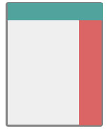
If you haven’t been down this route before, you will probably try something like
#sidebar-right{
  background: #123456;
}
As long as your sidebar is longer than your content you will think you have succeeded, but go to a page with long content and you will see: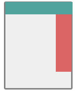
Argh! We want the sidebar background to go all the way down the page!
You’ve learned not to overthink when you’re dealing with css, so next you might decide to give the whole page the sidebar color and then give the content section its own background on top of that. This simply gives the opposite effect: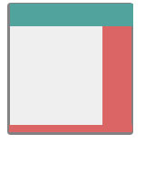
Now things only look right when the content is longer than the sidebar.
The easiest way to get things straight is to just suck it up and take it to Photoshop. Make an image with a 1px height and a width the same as your sidebar. Instead of applying the image as the background to your sidebar, you’ll apply it as the background to the whole page.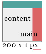
#main {
  background: url(images/sidebar.png) repeat-y top right;
}
If you have two sidebars, make one image the full width of the page.
Disadvantages:
You had to use Photoshop.
You can’t easily change your sidebar width.
You have to load one more image per page.
Advantage:
You’re done!
The same principle is very useful for theming panels. Panels are made up of one or more rows which each have one or more columns. Once you put content in the columns of varying height you get one ugly panel: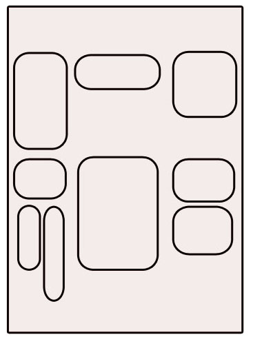
Do your panels kind of look like this too? Not good. This panel has two rows, and each row has 3 columns. Note that the second element in the second row’s first column (bottom left!) is actually a mini-panel containing two columns. Although the panel has a grid-like structure, the fact that all the content has varying heights makes it look like a mess and probably nothing like your designer’s mockup for your front page.
Adding backgrounds to the content will bring back order to the panel. But once again if you apply the background directly to columns you will end up with: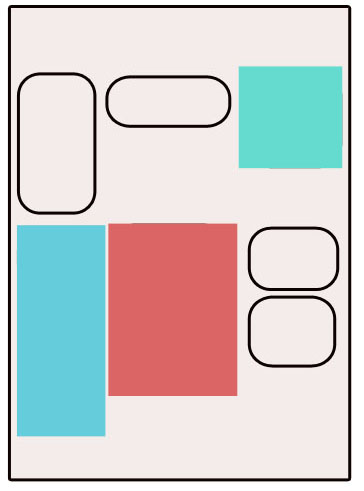
What you really want is more like: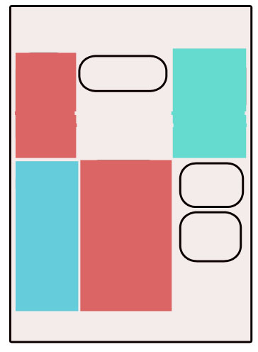
This is the kind of thing that I imagine was really easy back in the days of table-based layouts. Now that the web is all about dynamic content in divs of unpredictable heights, these kinds of things are more difficult. The answer is to, as in the sidebar example, create a background image for each row and tile it vertically.
Now your panels can have the tabled look they seem to be begging for and without the embarrassment of actually using tables! Does anyone have a preferable technique?
About Drupal Sun
Drupal Sun is an Evolving Web project. It allows you to:
- Do full-text search on all the articles in Drupal Planet (thanks to Apache Solr)
- Facet based on tags, author, or feed
- Flip through articles quickly (with j/k or arrow keys) to find what you're interested in
- View the entire article text inline, or in the context of the site where it was created
See the blog post at Evolving Web