
Upgrade Your Drupal Skills
We trained 1,000+ Drupal Developers over the last decade.
See Advanced Courses NAH, I know EnoughSetting up CSS Modules + Sass in a Gatsby Website
For many years styling websites with CSS has been pretty standard. A CSS stylesheet exists somewhere in your project which provides styles for your pages or components. Even with the introduction of CSS preprocessors like Sass, Less, Stylus, and PostCSS to mention a few, the ultimate result is for stylesheets to serve styles to your pages and website.
With the introduction of JavaScript frameworks such as React, NextJS, and others, the approaches for writing and serving CSS styles have become more complex and at times controversial. Things like CSS-in-JS (Reactjs.org defines this as “a pattern where CSS is composed using JavaScript instead of defined in external files"), can make some people question whether we are getting ourselves in trouble and whether we will regret going in this direction. It wouldn’t be the first time we find ourselves undoing practices we have followed for years because we realized there was a better way.
In GatsbyJS, a library of React, we can use different methods for styling a website. Some of these approaches include:
- Plain CSS
- Inline styles
- Styled Components
- CSS Modules
- Others
In most cases, people who lack the in-depth knowledge of CSS will opt for the easier way possible to style a website. This is not always the best way to go about it, but unfortunately, it is the reality. As someone who has worked with CSS for many years, I could technically pick any of the approaches above and accomplish my goal of styling a website, but I see issues with some of those practices and prefer to use an approach that provides flexibility, control, and best practices.
Choosing a Styling Method
Working for an agency where we build websites for clients of all sizes, many times the method we choose for doing something depends on the client’s preferences or skill level of their team. Meaning that we want to build a website that a client could take over and maintain on their own after our engagement with the client has scaled down. So even if I have a personal preference but the client has no experience or desire to work with that approach, I would need to provide a way for the client to work with a system or approach that may be more comfortable to them.
The one thing to keep in mind when choosing a method for styling your websites, Gatsby or otherwise, is that at the end of the day, we are producing plain CSS and as such, it should be well-written, and easy to maintain and scale. I am a fan of keeping styles simple, flat, and to a minimum. I don’t see the point of using over-engineered methods that complicate the most simple task.
CSS Modules
My approach of choice for styling React or Gatsby websites is CSS Modules because it most closely resembles the traditional way of styling websites I have grown accustomed to. As I alluded to before, my ultimate goal is to write proper CSS, following best practices, while leveraging styles scope, performance, and scalability. CSS Modules allows me to do all these things while providing an environment I am familiar with. I am not against learning new ways of doing things (I welcome them), but if new approaches don’t offer significant benefits, I don’t see the need of complicating my life and that of clients who will interact with my code.
In a typical Gatsby website, CSS Modules works out of the box without any special configuration. You can create any CSS files in your project, import them into the components you are working with and your styles will work. This is great and can get you very far if you are working with a simple website. However, this only works with plain CSS and not Sass. I personally like Sass because it provides features that are currently not available in CSS. Things like Mixins and nesting to mention a few. I will use Sass and SCSS interchangeably in this post to refer to the preprocessing process of compiling SCSS into plain CSS code.
Add Sass to Your Gatsby Website
Adding Sass to a Gatsby website is relatively easy. It’s a two-step process that includes installing a Gatsby plugin and adding a line of code to gatsby-config.js. Let’s do this now:
- While In your Gatsby project root directory, run the following command to install the gatsby-plugin-sass and node-sass plugins:
npm install node-sass gatsby-plugin-sass
Gatsby-plugin-sass has a dependency of node-sass and therefore we need to install both. - Edit gatsby-config.js (located in the root of you gatsby project), by adding the new plugin to the plugins array:
plugins: [`gatsby-plugin-sass`]
If you already have other plugins in place, you can add each new plugin in a new line within the array.
That’s it! Now Sass is available on your site.
Updating CSS Modules to use Sass
Now that we have Sass available, the last thing to do is to update CSS Modules to use Sass versus plain CSS. This is a two-step process:
- Rename any existing .css files to use .scss
- Update any imports of these files to also use .scss
Now you can take advantage of CSS Modules and Sass for writing great styles. Let’s go over a quick example of how CSS Modules works.
Using CSS Modules and Sass in Gatsby
Consider the following HTML/JS in your Gatsby Component (hero):
import React from 'react';
import PropTypes from 'prop-types';
import Image from 'gatsby-image';

import Heading from '../Heading';
import Link from '../Link';
import {fluidImage} from '../../global/js/customPropTypes';

const Hero = ({ title, image, body, path }) => {
  return (


          {title}

          {body}

        Learn more


  );
};

export default Hero;

Hero.propTypes = {
  title: PropTypes.string,
  body: PropTypes.string,
  image: fluidImage,
  path: PropTypes.string
};
Styling the Hero component above with CSS Modules will require we create a stylesheet for the Hero. Assuming you have a Hero folder inside components, which has an index.js for the component’s markup and JavaScript, create a file called hero.scss with the following code:
.hero {
  background-color:$color-white;
  position: relative;
}

.media {

  img {
    display: block;
    height: auto;
    max-width: 100%;
  }
}

.content {
  left: 50%;
  position: absolute;
  transform: translate(-50%, -50%);
  top: 50%;
}

.title {
  color: $color-secondary;
}
And finally, you would update index.js by first importing the hero’s stylesheet as follows:
import styles from './hero.scss';Then adding the respective CSS classes to each of the HTML elements in the Hero component. The end result of index.js would look like this:
import React from 'react';
import PropTypes from 'prop-types';
import Image from 'gatsby-image';

import Heading from '../Heading';
import Link from '../Link';
import styles from './hero.scss';
import {fluidImage} from '../../global/js/customPropTypes';

const Hero = ({ title, image, body, path }) => {
  return (


          {title}

          {body}

        Read the full article


  );
};

export default Hero;

Hero.propTypes = {
  title: PropTypes.string,
  body: PropTypes.string,
  image: fluidImage,
  path: PropTypes.string
};- When we imported the Hero styles into the component we used styles as the namespace in the import.
- To apply each of the CSS classes found in hero.scss to the markup in index.js we are using the className attribute since class is a reserved keyword in React/Gatsby.
- Then in curly brackets we apply each class by prefixing them with styles. For example:
…
If you render this component in the browser, what you will see as a result when you inspect the code is something similar to:
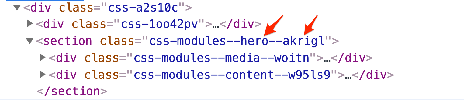
- Main things to note from the image above are the CSS classes added after css-modules--. These are the classes we created in hero.scss.
- The end of the class names (i.e. akrigl, woitn, w95ls9), are dynamic strings created by CSS Modules which ensure they are unique CSS classes. This prevents issues of regression and styles from leaking into other parts of your website.
- CSS Modules restricts the scope of its styles to only the component they are written for.
In closing
I like CSS Modules because it provides a familiar approach to working with Sass similar to that of a traditional Sass project. This works well with clients who are not well-versed in React or Gatsby but still want to be able to update styles.
About Drupal Sun
Drupal Sun is an Evolving Web project. It allows you to:
- Do full-text search on all the articles in Drupal Planet (thanks to Apache Solr)
- Facet based on tags, author, or feed
- Flip through articles quickly (with j/k or arrow keys) to find what you're interested in
- View the entire article text inline, or in the context of the site where it was created
See the blog post at Evolving Web